
This time around, I decided to do a few things differently. Instead of relying heavily on photographs, I wanted the piece to be primarily an acrylic painting with words and phrases incorporated into it. I also opted to go back to my original idea of using words cut out from magazines rather than selecting from the vast array of scrapbooking words I acquired for my previous collages—the former being a little more raw and random than the latter.
Now I just had to figure out what this collage was going to be about. I wanted the theme to be meaningful to Amanda, so I considered things such as motherhood, writing, art in general, doubt versus faith, etc. But none of these struck me as being the right one. So I laid out all the words I had cut out for my still-unfinished Growing Is Beautiful collage, hoping something would jump out at me. It didn't take long for words such as "seeds," "bloom," "scented," and "fresh" to catch my eye, and I quickly settled on the theme of "Spring" for my collage. Amanda's birthday falls in the midst of spring, she is an aspiring gardener, and the metaphors of spring apply beautifully to all the other topics I had considered—what could be more perfect?
With this in mind, I continued selecting words and joining them into short, interesting phrases. Once satisfied with the amount, I had to make them acid free so they would not deteriorate in the painting. This I accomplished by gluing the words onto a piece of cardstock, scanning the cardstock into my computer, and then ordering a full-size (8 x 10) photograph of the scanned image. This worked remarkably well, maintaining good color and print quality.
Next I moved on to color selection. I wanted colors that were bright but still clear and cool, reflecting not just the actual colors we see in spring but also the light and temperature of the season. Here are the practice swatches I painted:

After all this prep work, the actual creation of the collage took about 2 hours. Even with the use of a gel medium to extend the paint's drying time, I had to work quickly in order to blend the colors together a little and then apply the words while the paint was still wet. (I used the same PVC/methylcellulose mixture for an adhesive as I used in my previous collages.) All things considered, the process went quite smoothly.
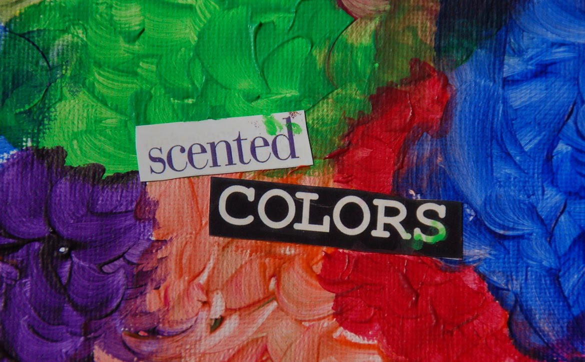
Here are close-up pictures of some of the phrases in my finished collage:


And here is the entire finished piece (click to enlarge):

You might notice that the final painting includes red, a color not on either of my practice swatches. This was a last-minute addition because something just seemed "not right" when I was painting the chosen color palette. Indeed, adding the red finished off the piece wonderfully and I am glad I included it.
I love the final product. In fact, now that I've given it away, I find myself missing it. This is a good thing, I think. And considering that Amanda and I are good friends, I only need to get myself invited to her house if I want to see it again!
PS—I'd love to hear thoughts on whether you like this representation of Spring or what you would do differently for your own take on this beautiful season.
I really like it! Its different and artsey...you nailed it.
ReplyDelete