This week we celebrated my friend Steve's 34th birthday—complete with party harts and hilarious party favors. I often have a difficult time coming up with gift ideas for guys. I suppose that's because most of the guys in my life are not sentimental, and I tend to give sentimental gifts. Thankfully, Steve is a writer, photographer, and artist extraordinaire, and that makes gift giving a whole lot easier.
A few weeks ago I decided I wanted to attempt a painting for Steve. I've really only dabbled in painting, most of it done in my Art 101 class in college and a few things over the ensuing years. Last Christmas, as a gift for my brother, I did my first canvas painting and used acrylic paint with a thickening medium mixed in. It turned out fairly well considering I have no drawing ability and the fact that I was making it for my somewhat un-sentimental brother:
Sadly, the picture doesn't show the colors very well, especially the variations in the water. But you can get the general idea, I think. I'm not convinced my brother liked it and I'm quite certain it is tucked away in a box or closet somewhere. Ah well. Such is the constant struggle of gifting to people who are so very different than me. I am still on the fence about whether to attempt another creative gift for my brother this year or to go with something more practical and thus more likely to be used and appreciated.
For Steve's painting I decided to go back to what I love most about painting: Color, color, and more color. I also wanted it to reflect Steve's great passion for spiritual growth and his efforts to pioneer an amazing small group model known as Christlikeness Groups. The main purpose in these groups is to encourage, support, and challenge one another to pursue the character of Christ in our daily lives. The first verse that came to mind for me as a representation of this was Galatians 5:22-23:
As I began to flesh out the logistics of this idea, however, I had a little revelation about the fruit of the Spirit. This passage from 1 Corinthians came to mind:
Again, the photo doesn't quite capture the depth of color and shading, but it's pretty close. Overall, I am very pleased with how it turned out. If you haven't gathered this already, I love color. I used about 25 colors for the outer circle and then combined all of them for the center space. I had the hardest time with the words, not just in the painting of them but in the choosing of where they should go.
When I initially came up with this idea, I wanted to choose a color that represented each attribute to me. For instance, the first color that comes to mind when I think of peace is blue. But as I went through the eight characteristics, I realized most of them I associated with the cooler colors of purple, blue, and green. In fact, the only ones I immediately pictured as warm or loud colors were joy and self-control. I spent a long time pondering this and trying out different combinations before settling on the final arrangement. Moving "faithfulness" to the warm side of the circle was a pretty easy transition for me because faith is so multi-faceted. Yes, it can be the quiet strength that holds us together but it can also be the active straining, fighting, and persisting as we seek to follow God's will and become more like Christ. Although I was initially resistant to placing "patience" on the color yellow, I realized that patience is best displayed in situations that are anything BUT calm, quiet, and peaceful. So even though these weren't necessarily the colors I would have chosen on first instinct, the end result seems just right.
When I gave the painting to Steve, he pointed out something I had missed entirely. I had not intended the center to be in any particular shape, mostly just wanting the borders to be fluid and unpredictable. Turns out, though, that it is actually in the shape of a bird:
Can you see it? The beak and head are at the top left, the tail feathers at the bottom right, and the two wings in between. Ever since Steve pointed that out, I can't stop seeing it when I look at the painting. It reminds me of this verse from Jesus' baptism:
A few weeks ago I decided I wanted to attempt a painting for Steve. I've really only dabbled in painting, most of it done in my Art 101 class in college and a few things over the ensuing years. Last Christmas, as a gift for my brother, I did my first canvas painting and used acrylic paint with a thickening medium mixed in. It turned out fairly well considering I have no drawing ability and the fact that I was making it for my somewhat un-sentimental brother:
Sadly, the picture doesn't show the colors very well, especially the variations in the water. But you can get the general idea, I think. I'm not convinced my brother liked it and I'm quite certain it is tucked away in a box or closet somewhere. Ah well. Such is the constant struggle of gifting to people who are so very different than me. I am still on the fence about whether to attempt another creative gift for my brother this year or to go with something more practical and thus more likely to be used and appreciated.
For Steve's painting I decided to go back to what I love most about painting: Color, color, and more color. I also wanted it to reflect Steve's great passion for spiritual growth and his efforts to pioneer an amazing small group model known as Christlikeness Groups. The main purpose in these groups is to encourage, support, and challenge one another to pursue the character of Christ in our daily lives. The first verse that came to mind for me as a representation of this was Galatians 5:22-23:
But the fruit of the Spirit is love, joy, peace, patience, kindness, goodness, faithfulness, gentleness and self-control. Against such things there is no law.
In essence, the character of Christ is the fruit of the Spirit. We cannot become more like Christ apart from the Spirit, both in the long-term development of our character and in the moment-by-moment empowering to act according to the spiritual nature. Thus, I decided I wanted this painting to serve as an abstract representation of the fruit of the Spirit, assigning each attribute a color and somehow incorporating them all into a harmonious whole. As I began to flesh out the logistics of this idea, however, I had a little revelation about the fruit of the Spirit. This passage from 1 Corinthians came to mind:
Love is patient, love is kind. It does not envy, it does not boast, it is not proud. It is not rude, it is not self-seeking, it is not easily angered, it keeps no record of wrongs. Love does not delight in evil but rejoices with the truth. It always protects, always trusts, always hopes, always perseveres. Love never fails. (1 Corinthians 13:4-8)
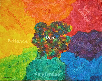
It seems clear from these verses that love is not just another characteristic of Christ or another dimension of the fruit of the Spirit. Love, in fact, is composed of all the other attributes combined. Love is not just one color; love is all colors and then some. And that idea led me to create this painting:Again, the photo doesn't quite capture the depth of color and shading, but it's pretty close. Overall, I am very pleased with how it turned out. If you haven't gathered this already, I love color. I used about 25 colors for the outer circle and then combined all of them for the center space. I had the hardest time with the words, not just in the painting of them but in the choosing of where they should go.
When I initially came up with this idea, I wanted to choose a color that represented each attribute to me. For instance, the first color that comes to mind when I think of peace is blue. But as I went through the eight characteristics, I realized most of them I associated with the cooler colors of purple, blue, and green. In fact, the only ones I immediately pictured as warm or loud colors were joy and self-control. I spent a long time pondering this and trying out different combinations before settling on the final arrangement. Moving "faithfulness" to the warm side of the circle was a pretty easy transition for me because faith is so multi-faceted. Yes, it can be the quiet strength that holds us together but it can also be the active straining, fighting, and persisting as we seek to follow God's will and become more like Christ. Although I was initially resistant to placing "patience" on the color yellow, I realized that patience is best displayed in situations that are anything BUT calm, quiet, and peaceful. So even though these weren't necessarily the colors I would have chosen on first instinct, the end result seems just right.
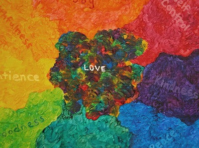
When I gave the painting to Steve, he pointed out something I had missed entirely. I had not intended the center to be in any particular shape, mostly just wanting the borders to be fluid and unpredictable. Turns out, though, that it is actually in the shape of a bird:
Can you see it? The beak and head are at the top left, the tail feathers at the bottom right, and the two wings in between. Ever since Steve pointed that out, I can't stop seeing it when I look at the painting. It reminds me of this verse from Jesus' baptism:
As soon as Jesus was baptized, he went up out of the water. At that moment heaven was opened, and he saw the Spirit of God descending like a dove and lighting on him. (Matthew 3:16)
I love how God shows up in the smallest places. Not because He has to or because we ask Him to or because we might notice it. He just shows up because He wants to, because He's God, because He loves us. Isn't He great?


It's amazing to me how much of yourself you pour out in love toward other people. Thank you for thoughtfulness and generosity in bestowing upon me a Courtney original!
ReplyDeleteThis one won't end up in a box!
ReplyDeleteI can't stop seeing the bird, either, and it really is a lovely, dream-like image. I enjoyed reading your further explanation of how you chose each color for the words, because as you say, they just seem right, even if they're not exactly what you might have picked if you were choosing for them individually. I do like patience as yellow!
I will also vouch that the colors are more vibrant and textured in real life and just all-over gorgeous. Come and see it hanging up soon! :)
P.S. Glad you liked the party favors. Corin helped me pick them out.
P.P.S. It's fun to see the painting you made your brother. I remember you were talking about it, and I wondered what you'd chosen to paint. I bet he loved it, even if he's not the artsy type.
ReplyDelete